Visual Hierarchy and Placement
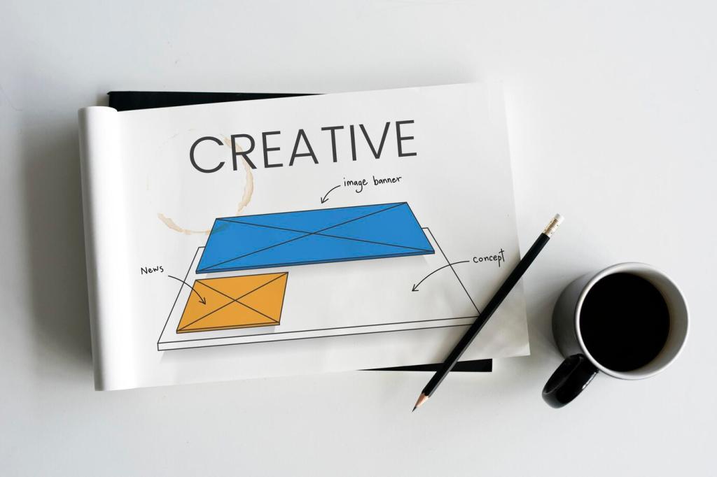
Keep a primary CTA visible early, but earn attention with contrast, whitespace, and proximity to a strong value statement. Bold does not mean loud; it means unmistakable. Treat the button like a design element with a job to do.
Visual Hierarchy and Placement
Use repeated, consistent CTAs to create a predictable cadence: hero, mid‑page proof, and footer recap. Label each instance contextually, never copy‑paste blindly. Rhythm builds confidence, and confidence reduces the effort required to click.


